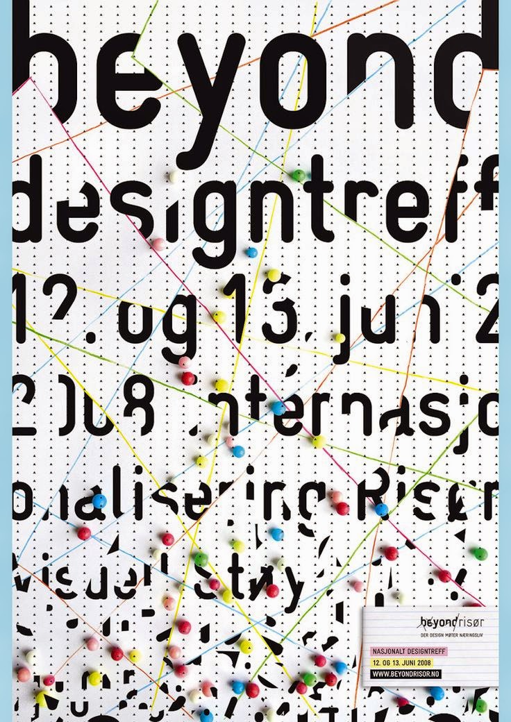
How will you get, and keep, your audience's attention?
Here are some examples of designs that VISUALLY grab your attention...... perhaps they might influence your ideas too?
*These were shamelessly grabbed from https://www.pinterest.com/lafillerose/i-graphic-design/
Blended, curved lines inside the letters used as clipping masks
This is a great use of pattern swatches in the background and in the letters
This uses the blend tool to blend individual letters to the background shape. The top letter of the blend was then set with a white fill.
You could live trace, copy paste to make three versions of the image, then use red,green and black fills on them. Last, set their opacity to 80%...
Cool use of the gausian blur effect on the background, and nice "breaking" the image and type with pathfinder...
You could 3D etrude to make the shapes,
then select and fill them separately with pattern swatches...
Blend tool, or copy paste in front... cool structure here..
More breaking with pathfinder- divide...
love the 90's!!
Neat use of borders to organize and structure...
More cool borders.... Japanese design...
Great positive and negative space here...
Fun use of the blur effect, and colors


No comments:
Post a Comment