Tuesday, March 31, 2015

What's the "Hook"?

One key question to consider when creating your type poster is:

How will you get, and keep, your audience's attention?

Here are some examples of designs that VISUALLY grab your attention...... perhaps they might influence your ideas too?

*These were shamelessly grabbed from https://www.pinterest.com/lafillerose/i-graphic-design/

Blended, curved lines inside the letters used as clipping masks


This is a great use of pattern swatches in the background and in the letters


This uses the blend tool to blend individual letters to the background shape. The top letter of the blend was then set with a white fill.

You could live trace, copy paste to make three versions of the image, then use red,green and black fills on them. Last, set their opacity to 80%...


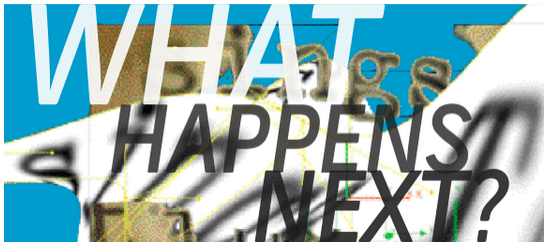
Cool use of the gausian blur effect on the background, and nice "breaking" the image and type with pathfinder...


You could 3D etrude to make the shapes, 
then select and fill them separately with pattern swatches...


Blend tool, or copy paste in front... cool structure here..


More breaking with pathfinder- divide...


love the 90's!!


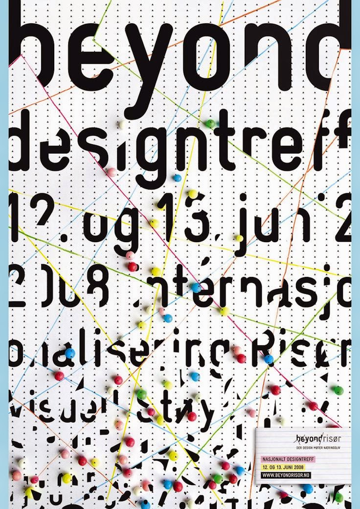
Neat use of borders to organize and structure...


More cool borders.... Japanese design...


Great positive and negative space here...


Fun use of the blur effect, and colors


Friday, March 27, 2015

Quick Trick With Text

BREAK some type with this simple trick....

Create your own "broken type" sample, and post it to your blog.

• Write down the name of the FONT you used too, please.

Here's the pathfinder tool ....


Process is....

1. Choose a font and write out the word, or words...
2. Convert the type to shapes using "create outlines" command...
3. Create a new shape to use as a "dividing" shape....
4.  Use Pathfinder- "divide" command to break it into pieces...
5. Use "ungroup", or isolation mode to select, delete, or move pieces to create the "broken type".
COOOOOOOL!!!!! and Fun!

And here's a screen shot of the process....


How far could YOU push the "broken" effect?   What about adding a 3D effect?


Thursday, March 26, 2015

David Carson

One of the groundbreaking designers of our generation- Carson changed how designers use type on the page. He pushed the limits until it was almost unreadable.

See more of his work here @ http://www.davidcarsondesign.com/


Monday, March 23, 2015

A Lead Up To The Type Poster


Explore the possible tools to use, and the expressive possibilities of type, by creating a series of designs using letters.....

POST
your designs and list what 5 changes you made to the type to make it look like what it means....

Here is the list of items to change:

Size
shape
color
orientation
style
location
texture
background color or fill


Here's the handout:


Some Possible Examples....


It Seems to move.... they used a "blur" effect, or multiple copy pastes...


Neat use of the gradient tool.


This is from Kim's blog, 3D extrude and more blurring...


 Cool textures..... use effect-pixelate-mezotint..


 Great use of positive and negative space....

Bembo's Zoo Project (Working with typography)

Here's the plan:

Take a look at the "Bembo's Zoo" site to get some ideas of how you might build with letter forms.. @ http://www.bemboszoo.com/


Then,

Create your own image of a creature, using only the letters in the NAME of the creature. Consider these requirements:
1. Keep the font readable- even though you may distort it...
2. Choose a font that works with the personality of the object you are creating.
3. Try using the tools and skills we have learned so far in creating this image... How far can you "push" the idea?

Post your design, and explain at least two things you did to make the letters look like the object. (What font you chose, how you distorted it, values, sizes, or others...)

Friday, March 20, 2015

Ticket Design Checklist

Sorry, I'm out today.

Here is a "checklist" of requirements for the ticket design..... same list I had on the board Thursday...

1. Does your design relate to a "theme"? What visual clues did you use to help the viewer understand the theme?

2. TYPOGRAPHY- choose letter styles that match the theme.... Be SURE it is easy to READ the information.

3. Is it interesting and eye catching? How will you visually lead the viewer through the information?

4. Is there an area of EMPHASIS?

5. How will you create VISUAL TEXTURE? You could use effects, pattern swatches, or live traced images...

6. ANOTHER THOUGHT, be sure it is easy to cut out the ticket! They have to print and cut 100's of them! :)


Tuesday, March 17, 2015

An Ingenious Idea


Check out this wonderful site and type design....... Look how even TYPE DESIGN could react to conservation/recycling and the problems of pollution.

Also, a great example of a creative thoughtful designer!!! :-)


Here's the link @ http://www.creativebloq.com/typography/what-makes-good-font-81412743

and the video directly...


Friday, March 13, 2015

Designing the "Sea You Later" Dance Ticket...

Mr Dupuis has asked us to create designs for

He said, "The theme of the dance is the "Sea" and thus the "Sea Ya Later" title.  It's an all grade dance that is intended for all students to come and say goodbye to the seniors, as it will be the last dance of the year.  Here is the information that you might need for the tickets."

Info to go on the tickets!

Date: Friday, May 1st, 2015
Price: $15.00 per ticket
Time: 7:00pm - 10:30pm
DJ: DJ Chalupka​
Location: WA Gymnasium
Light refreshments will be provided.

REQUIRED processes for your design-

1. Create a brainstorm map for the "saying goodbye to seniors" theme... have 20 branches minimum.
2. Create two cut out examples of the SIZE of the ticket. Size it to get the most out of letter size paper (8.5X11)
3. Use a color scheme for your design. (post it)
4. Create VISUAL TEXTURE in your ticket with pattern swatches, effects, blends, or live tracing.
5. DO NOT JUST TAKE AN IMAGE OFF THE WEB AND USE IT in your design..... modify it to make your work unique!

Wednesday, March 11, 2015

Design Research

Explore and Gather examples of good design - in order to EXPAND your understanding of how designers visually communicate a message.


Look through the "Design Envy" site to find two examples of good designs.
Here is the link http://designenvy.aiga.org/page/2/

*Google the designer's name to find their web site to see more of their work....

Les Graphiquants

THEN

1. Post three images of the design you like....
2. Describe how the designer communicated the message to you- which element of art did they use most: color, contrast, patterns, shapes, words, or others?
3. Describe what THEME you think matches the design sample. How does it make you feel?
4. Post a link to the designer's web site, so we could check out more of their work too.

Monday, March 9, 2015

POSTING your book pages

Post a jpeg of each page design...... Then answer these questions about your design work:

1. What is the focal point of the design? What makes it visually stand out (contrast, size, shape, location, meaning, or something else)?

2. How does this design relate to your theme? Is it through: images, values, letters, or other ways?

The 5th Design!!! COLOR

Here is info for you about the final design for the book.......

1. Paper Size is "Legal", or 14 inches wide and 8.5 inches tall....
        ARTWORK SIZE is 12 wide and 8 tall....

2. Use COLOR to create DEPTH and EMPHASIS

3. The design should respond to your book's THEME....

4. The design must use a planned color SCHEME from the list below...

Here is a link to a former student's design..... http://awarner2014.blogspot.com/2013/03/color-design.html


Here are some resources: