The smarter selection tool for most jobs....
Here is the tool....
Here are controls for it......
and another control for it....
Link to more info.... http://www.photoshopessentials.com/basics/selections/quick-selection-tool/
SKILLS LIST
- COLOR SCHEME TOOL
- Customize Your Blog!!!
- START BLOGGING HERE
- Pinterest Site for Examples....
- Recolor Artwork
- PATHFINDER TOOL
- Experimental Design (Keetra Dixon)
- LOGO examples
- DESIGN RESEARCH
- Hillman Curtis' "Artist Series" videos
- "Rise and Shine" Video Series
- Rule Of Thirds
- AIGA Site
- Communication Arts Link
- History of Graphic Design
Thursday, December 17, 2015
LAYER MASKS
Used to HIDE and REVEAL pixels on layers...
Here is what they look like on the layers palette.....
Use the BRUSH TOOL to paint on the mask with BLACK (to hide) or WHITE (to reveal)....
Here are the brush controls.... get it by "right clicking" with the brush tool
Here is what they look like on the layers palette.....
Use the BRUSH TOOL to paint on the mask with BLACK (to hide) or WHITE (to reveal)....
Here are the brush controls.... get it by "right clicking" with the brush tool
ADJUSTMENT LAYERS
Here is the control pannel....
AND how it looks in the LAYERS pannel...
And a LINK to more info...... https://99designs.com/designer-blog/2013/12/02/how-to-use-adobes-adjustment-layers-photoshop-cs6/
AND how it looks in the LAYERS pannel...
And a LINK to more info...... https://99designs.com/designer-blog/2013/12/02/how-to-use-adobes-adjustment-layers-photoshop-cs6/
Tuesday, December 15, 2015
PHOTOSHOP!!!!
Photoshop is a very powerful and complex program- AND it's lots of FUN!
So, let's get to it!!!!!
Here is a handout of the basic concepts-
AND, and outline of the skills we are planning to learn- psyched!
LINKS! Here are some great links to tutorials for Photoshop CS6
http://tv.adobe.com/show/learn-photoshop-cs6/
EXTRA HELPERS
So, let's get to it!!!!!
Here is a handout of the basic concepts-
AND, and outline of the skills we are planning to learn- psyched!
LINKS! Here are some great links to tutorials for Photoshop CS6
http://tv.adobe.com/show/learn-photoshop-cs6/
EXTRA HELPERS
POST the PACKAGE DESIGN
Complete the project by posting images and writing to explain how you solved the assignment.
IMAGES- Post two or three images to show off your design. Use the paper photo "booth" to get the best images without distractions.
WRITING- Describe how you solved the project by answering these questions:
• What was your color scheme?
• What was your word?
• How does the color, images, type and other visuals in your design relate to your word?
• How did you lead the viewer around the 3D object?
• Is there an area of EMPHASIS?
Monday, November 9, 2015
POST YOUR COLOR SCHEME!
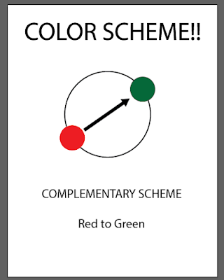
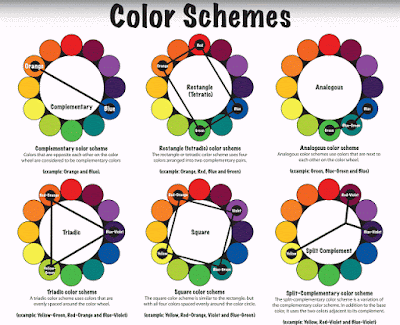
Draw a diagram of your color scheme...... fill in YOUR colors on the scheme.....
Here is one example...
Here are the scheme diagrams again....
Here is one example...
Here are the scheme diagrams again....
TYPEFACE?!!!!!! What fun!
Check out this designer's site!
He is known as an illustrator, but also does game design, animation, character design and more!
Another great example of CREATIVE solutions to common projects.... type design, and others...
See more here @ http://www.pokedstudio.com/new-gallery-5/
He is known as an illustrator, but also does game design, animation, character design and more!
Another great example of CREATIVE solutions to common projects.... type design, and others...
See more here @ http://www.pokedstudio.com/new-gallery-5/
Another Cool TYPEFACE Design is here @ https://www.behance.net/gallery/26513925/ISOLATION-Poster-Interactive-Article
ONE MORE cool use of type with design work.... look at this APP design..... wonderful personality to the whole piece...
See more here @ https://www.behance.net/gallery/19266209/CLOSER-TO-NOWHERE
Thursday, November 5, 2015
TYPE POSTER BASICS
Here are directions for the TYPE POSTER project....
GOAL is to make the poster LOOK like what it MEANS.....
SIZE is 12 x 18 inches using Illustrator
#1. MESSAGE- choose a message to convey with your poster..... the message must be readable somewhere in the poster.
#2. STRUCTURE- What structure will you use to organize the poster? A grid, Columns? or no structure (like David Carson)
#3 TYPEFACE- Choose type that matches the meaning of your message.
#4 COLOR- choose a color scheme to follow in your design..... Use the samples posted to the blog LINK HERE
#5 DESIGN- Create more than one object of EMPHASIS. Create MOVEMENT with shapes, color, value, lines, or patterns. Break up the page into POSITIVE and NEGATIVE SPACE SHAPES.
#6 VALUE and CONTRAST- Create a range of values and use contrast in your design.
#7. TEXTURE- create visual texture in your poster design with pattern swatches, image trace or effects.
Tuesday, October 27, 2015
Type Poster Info
Let's start thinking about your TYPOGRAPHY Poster....
#1. What's the "hook".... what will make the viewer stop and look at your poster?
Gather some examples that you like from this site http://digidesignone.blogspot.com/2015/03/whats-hook.html
or from this site.... https://www.typographicposters.com/
OR from this site..... http://www.smashingmagazine.com/2008/02/breathtaking-typographic-posters/
Friday, October 23, 2015
8 Type Designs
Here's the handout!!
HERE is another link to more info! http://digidesignone.blogspot.com/2015/03/a-lead-up-to-type-poster.html
HERE is another link to more info! http://digidesignone.blogspot.com/2015/03/a-lead-up-to-type-poster.html
Wednesday, October 21, 2015
Cool type designs
Here are some neat designs I just found....
see more here https://www.behance.net/gallery/26301003/36-Days-Of-Type-2015
see more here https://www.behance.net/gallery/26301003/36-Days-Of-Type-2015
Monday, October 19, 2015
TYPEFACE DESIGN
Creating your own typeface requires you to think of several things:
1. What is the THEME, or personality of the type?
• Is it old fashioned, modern, scary, clumsy, techno.....or other personalities?
• How does the SHAPE and VALUE (light and dark) of the typeface relate to the theme?
• How does the type sit on the BASELINE?
• What shape does each letter have in common? Consider: x- height, stem, serifs, bowl, descender?
WHEN COMPLETE, present your typeface on the blog and label these parts: stem, serifs, bowl and descender.
Remember this post? See it again @ http://www.thinkingwithtype.com/contents/letter/
Friday, October 16, 2015
DESIGNER to KNOW
PAULA SCHER
Check out these links to see more about this dynamic graphic designer...
http://paulascherfan.tumblr.com/
http://www.aiga.org/medalist-paulascher/
Check out these links to see more about this dynamic graphic designer...
http://paulascherfan.tumblr.com/
http://www.aiga.org/medalist-paulascher/
Thursday, October 15, 2015
PEN TOOL MANIA
Let's get more of an understanding of the mighty PEN TOOL by learning some important basics about the tool:
1. Pen tool draws paths as you place ANCHOR POINTS on the art board.
2. DIRECTION LINES are "handles" that control the curve of a path.
3. SHIFT and OPTION keys are modifiers for the pen tool
4. Move anchor points with the DIRECT SELECT TOOL (the white arrow)
Find more info at these links
Best One is HERE
ADOBE'S printed info is here @ http://www.adobepress.com/articles/article.asp?p=1652772&seqNum=3
For a nice VIDEO about the pen tool Click Here
Tuesday, October 13, 2015
Creating a Type Face
ANOTHER important DESIGNER'S SKILL is to understand about TYPE- it's history, shape, personality, font families and how to manipulate it in design....
Here is a great place for more specifics @http://www.thinkingwithtype.com/contents/letter/
Here is a great place for more specifics @http://www.thinkingwithtype.com/contents/letter/
AND this link to see examples of type face designs.... https://www.fontshop.com/people/fontshop-team/fontlists/free-fonts
Another wonderful site for the history of type is here @ http://ilovetypography.com/2010/08/07/where-does-the-alphabet-come-from/
Wednesday, September 30, 2015
Designing With GRIDS and TYPE
One of the most important skills to learn in graphic design is the common use of a "grid" to organize information. Here are some links to more info about grids in PRINT and for the WEB
This site is for grids used in web design http://www.smashingmagazine.com/2007/04/designing-with-grid-based-approach/
And grids for print design is here @http://www.thinkingwithtype.com/contents/grid/
This site is for grids used in web design http://www.smashingmagazine.com/2007/04/designing-with-grid-based-approach/
And grids for print design is here @http://www.thinkingwithtype.com/contents/grid/
Tuesday, September 29, 2015
SCREENSHOT Envy
Build an image using SCREENSHOTS and a GRID
Screenshot is "command" + shift + 4
TO DO:
1. Select and download an image into Illustrator.
2. Create a grid to use in your design..... any size you want..
3. Use screen shots to "dissect" the image and rebuild it using the grid.
4. You do not have to "image trace", just play with the screen shots.
Consider
*what happens to a small screen shot image if you enlarge or stretch it... interesting
* Use the clipping mask feature to "crop" an enlarged image to fit the grid....
Creativity Questions
* How will you use the grid to organize your image?
* How will you make EMPHASIS?
Here are controls for the grid...
Monday, September 14, 2015
Wonderful Examples of Creative Design (composition)...
Check out the winners of the illustration awards- notice how they: break up the page, have an object of emphasis, and move you through the image...
See the work here @http://www.theaoi.com/awards/archive-winner.php
Another good source is here @ http://designarchives.aiga.org/#/entries/%2Bcolors%3A%22r130g155b64%22/_/grid/relevance/asc/0/48/90
Please collect one example that you like and post the link to the designer's web site on your blog...
I liked Paul Wearing's work....
see more about him here @http://paulwearing.co.uk
Adding Type!
The fourth page of your book uses TYPE (letters and numbers) as the only shapes on the page....
Let's explore the tools to use in making type-
The type tool-
Choosing a font-
Choosing type Alignment-
Let's explore the tools to use in making type-
The type tool-
Choosing a font-
Type Control pannel-
Choosing type Alignment-
Monday, September 7, 2015
Gradients!
Love 'em! Let's make gradients and even gradients on lines!
Here is a closer look a the gradient control palette....
Here is the swatches palette.....
AND here's a great little movie about placing gradients onto strokes (lines) @ http://tv.adobe.com/watch/learn-illustrator-cs6/gradients-on-strokes/
Here is a fun example of what you could do with the gradient tool! Look how the artist manipulates the tool to get visually amazing results. See more here @ http://www.digitalartsonline.co.uk/tutorials/adobe-illustrator/create-incredible-subtle-gradients/#1
See more about the artist, Alexandra Zutto here @ http://zuttoworld.com/
and here @ http://design.tutsplus.com/articles/interview-with-zutto--vector-2367
Subscribe to:
Comments (Atom)


