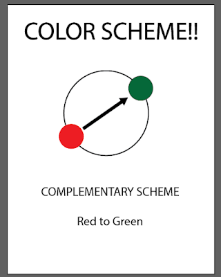
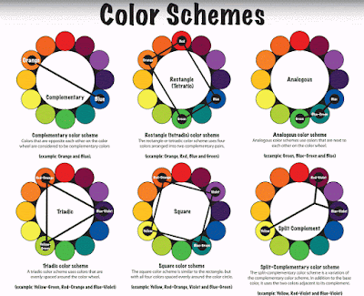
Draw a diagram of your color scheme...... fill in YOUR colors on the scheme.....
Here is one example...
Here are the scheme diagrams again....
SKILLS LIST
- COLOR SCHEME TOOL
- Customize Your Blog!!!
- START BLOGGING HERE
- Pinterest Site for Examples....
- Recolor Artwork
- PATHFINDER TOOL
- Experimental Design (Keetra Dixon)
- LOGO examples
- DESIGN RESEARCH
- Hillman Curtis' "Artist Series" videos
- "Rise and Shine" Video Series
- Rule Of Thirds
- AIGA Site
- Communication Arts Link
- History of Graphic Design
Monday, November 9, 2015
TYPEFACE?!!!!!! What fun!
Check out this designer's site!
He is known as an illustrator, but also does game design, animation, character design and more!
Another great example of CREATIVE solutions to common projects.... type design, and others...
See more here @ http://www.pokedstudio.com/new-gallery-5/
He is known as an illustrator, but also does game design, animation, character design and more!
Another great example of CREATIVE solutions to common projects.... type design, and others...
See more here @ http://www.pokedstudio.com/new-gallery-5/
Another Cool TYPEFACE Design is here @ https://www.behance.net/gallery/26513925/ISOLATION-Poster-Interactive-Article
ONE MORE cool use of type with design work.... look at this APP design..... wonderful personality to the whole piece...
See more here @ https://www.behance.net/gallery/19266209/CLOSER-TO-NOWHERE
Thursday, November 5, 2015
TYPE POSTER BASICS
Here are directions for the TYPE POSTER project....
GOAL is to make the poster LOOK like what it MEANS.....
SIZE is 12 x 18 inches using Illustrator
#1. MESSAGE- choose a message to convey with your poster..... the message must be readable somewhere in the poster.
#2. STRUCTURE- What structure will you use to organize the poster? A grid, Columns? or no structure (like David Carson)
#3 TYPEFACE- Choose type that matches the meaning of your message.
#4 COLOR- choose a color scheme to follow in your design..... Use the samples posted to the blog LINK HERE
#5 DESIGN- Create more than one object of EMPHASIS. Create MOVEMENT with shapes, color, value, lines, or patterns. Break up the page into POSITIVE and NEGATIVE SPACE SHAPES.
#6 VALUE and CONTRAST- Create a range of values and use contrast in your design.
#7. TEXTURE- create visual texture in your poster design with pattern swatches, image trace or effects.
Subscribe to:
Comments (Atom)


