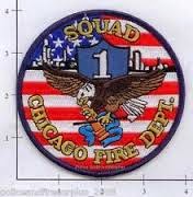
Here's a link to some interesting ideas about badge symbols....
http://smithwarrenbadges.wordpress.com/2013/04/18/firefighter-badges-rich-in-history-and-symbolism/
And some info about how the badges are made....
http://www.patchsupply.com/how-patches-are-made-patch-supply.html
SKILLS LIST
- COLOR SCHEME TOOL
- Customize Your Blog!!!
- START BLOGGING HERE
- Pinterest Site for Examples....
- Recolor Artwork
- PATHFINDER TOOL
- Experimental Design (Keetra Dixon)
- LOGO examples
- DESIGN RESEARCH
- Hillman Curtis' "Artist Series" videos
- "Rise and Shine" Video Series
- Rule Of Thirds
- AIGA Site
- Communication Arts Link
- History of Graphic Design
Tuesday, October 28, 2014
Thursday, October 23, 2014
Design Research for Fire Badge
Research what the badge means and how colors, shapes and icons are used in other fire company badges...
Collect 5 examples of badges from fire companies.... post them to your blog.
Collect 5 examples of badges from fire companies.... post them to your blog.
Tuesday, October 21, 2014
Building the Fire Department Patch
We have been asked to redesign the fire department's logo and patch!
Here is their current patch design....
And here is a better version you could use to trace....
Now, he also wants the American flag in the design, sooooooo one idea is-
and other info from our client, "We have a slogan that we adopted a few years back "Neighbors Helping Neighbors." That may be something to also incorporate.
Here are some examples of words in the badges....
Here is another link to more ideas for symbols in the badge... http://www.signology.com/firefighterSymbols.php
Thursday, October 16, 2014
Pathfinder info for you
Here is a link to some great info about the PATHFINDER tool...
http://design.tutsplus.com/tutorials/a-comprehensive-guide-to-the-pathfinder-panel--vector-3306
http://design.tutsplus.com/tutorials/a-comprehensive-guide-to-the-pathfinder-panel--vector-3306
About that Apple Logo Story......
Here is a link to and interview with the designer of the apple logo..... look what he says about the idea behind the logo!
http://creativebits.org/interview/interview_rob_janoff_designer_apple_logo
http://creativebits.org/interview/interview_rob_janoff_designer_apple_logo
Wednesday, October 8, 2014
GETTING INTO LOGOS
Our next big project involves Logos, or IDENTITY DESIGN. We will be creating visual symbols that represent an idea, or theme.
Here are some wonderful examples of Logos and critiques of them... http://www.howdesign.com/design-creativity/projects-profiles/logo-design-competition-awards-winners/
Follow this link to a web hunt challenge... http://wawacdesign.blogspot.com/2012/10/work-for-thursday-october-11th.html
Gather 20 samples of good logos and post them to your blog..... that will be our foundation for designing new logos!!!
Go to it!!
Monday, October 6, 2014
MORE IDEAS!!!!
Check out this link to RISD's (rhode island school of design) graphic design students' work
http://monospace.risd.gd/
http://monospace.risd.gd/
Thursday, October 2, 2014
BOOK COVER
Design the cover for your book!
The design has to have this information:
• Your name
• The Book's title (do not call it "My book of designs")
• Images that remind or suggest what is inside the book...
The SIZE is smaller... it is 5 inches wide by 8 inches tall....
The design has to have this information:
• Your name
• The Book's title (do not call it "My book of designs")
• Images that remind or suggest what is inside the book...
The SIZE is smaller... it is 5 inches wide by 8 inches tall....
POST IT-
Post images of your book designs and answer these questions about the work:
1. What is the focal point (Emphasis)? How did you make it easy to notice? *using contrast, shape, size, location, color are ways to make it stand out
2. What is the most successful part of your design?
3. What was your theme? How do these images relate to your theme?
1. What is the focal point (Emphasis)? How did you make it easy to notice? *using contrast, shape, size, location, color are ways to make it stand out
2. What is the most successful part of your design?
3. What was your theme? How do these images relate to your theme?
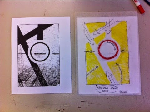
MAP YOUR WORK
Use trace paper to create a "map" showing these principals:
Outline and label the border, or edge of the design space.
Outline and label the areas of EMPHASIS- (color it in too)
Draw arrows to show MOVEMENT through the design
• You can move over lines, edges, shapes, changes in value, or even words....
Color in the NEGATIVE SPACE to show how big it is, where it is and what shape it has...
Put your name on it and pass it in to me, please
Subscribe to:
Posts (Atom)


 a
a


